Code
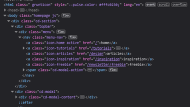
Just like the Envy Labs review, the source code for Veerle was easy for a person to read and understand. The page was sectioned with divs, and the names of classes were specific to the purpose the class served in the page's design. Looking at the code was not intimidating, and it was structured intuitively.
User Interface - UI
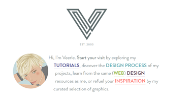
The user interface was easy to navigate. There is a white background, with a lot of eye-catching colors drawing your attention to various sections of the page. The content is spaced well, and it's easy to determine where one section ends and another begins.
User Experience - UX
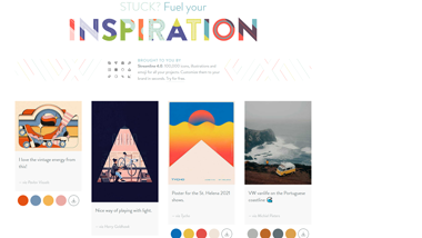
I might be in the minority here with my user experience, but I felt like the site was a bit of an eyesore. I am more of a fan of dark themes, and found the design and color choices to be distracting and hard to look at. It feels like there's too much going on all at once with the design.
Summary
Overall, Veerle is a simply structured website that is easy to navigate and understand. It properly utilizes design techniques such as section spacing. It has a rich and diverse color scheme that contrasts with a white background, and incorporates unique geometric designs.