EXTRACT UI ITEMS
Octo-Kitty Picture
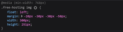
User Interface Discussion
I liked this item because I honestly thought it was super cute and it caught my attention right away. I liked how the image seemed to overlap the areas around it, and wasn't perfectly contained in the element it appears to be layered on top of.
There were a couple techniques I'm noticing were used to create this item. It's an element that's floated to the left. It appears to overlap the areas around it partly due to the negative margins that are also applied to it. The image has a transparent background.
Yellow Arrow Pointing Down
User Interface Discussion
I liked this UI item because when I first saw it, I didn't understand how such a thing was implemented into the code. Just like the octo-kitty, it seemed to overlap the element/div it was layered on top of.
So, there are a few things that made this design possible. The first was that this arrrow is a picture and a pseudo-element. It was creating using the pseudo-element "::after", along with being an object that floats to the right. Also, it appears the image has an absolute position, with it's positioning defined by the "right" and "bottom" property values.
Box Title
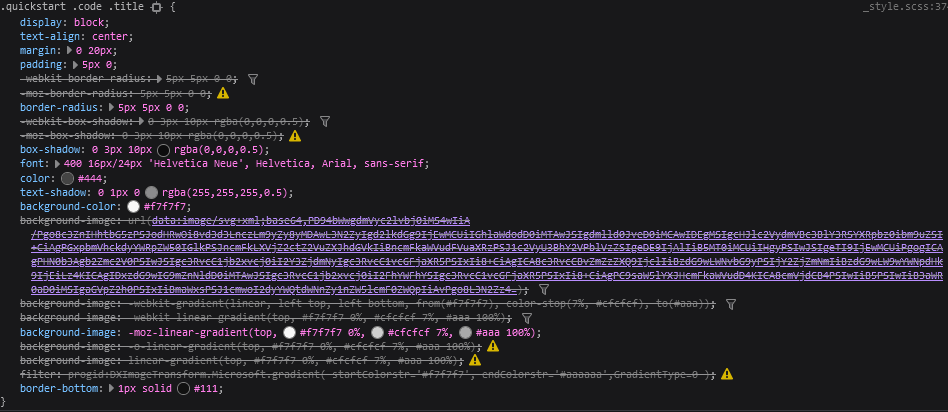
User Interface Discussion
What I liked most about this box title I found on the home page is how subtly three-dimensional this item appeared.
So, there's honestly a lot going on here in the CSS of the code. The main things though that I think make this box title "pop" and appear slightly three dimensional in appearance is the box-shadow properties applied to it, as well as the gradiant background color applied to it. Along with the background color being a gradient, each color in the gradient has a certain percentage applied to it. To add to the effects, the text in the box title also has a text shadow applied.
Triangle Pointer to Side Links
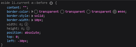
User Interface Discussion
My final pick for this assignment was the triangle pointer that appeared beside the list items you clicked on for the docs page. I liked this because it seemed complex to me and I wanted to understand how it was designed. Upon inspection, I realized it wasn't quite as complicated as I thought it would be, though is still something I wouldn't have known how to do on my own.
Like other items I've inspected for this assignment, it is a pseudo-element, appearing before the side link content. It is a border, with 3 out of 4 colors listed appearing as transparent, making the pointer look like a triangle. It also has an absolute position, with a left value of -30. The border is also the same color as the background color of the div element to it's left, making it appear as though it belongs as a part of that div element.